Responsive Web Design

Professional responsive web design services in the UK. Mobile-first approach ensuring your website looks perfect on all devices with optimal user experience.

Responsive Web Design
MOBILE-FIRST DESIGN

Beautiful Websites for Every Device

In today's mobile-first world, your website must look and function perfectly on every device. Our responsive web design services ensure your site provides an exceptional user experience whether viewed on a smartphone, tablet, laptop, or desktop computer.

User-centered design that converts visitors into customers

Improved search rankings with mobile-optimized design

Lightning-fast performance across all devices

Responsive Web Design
All Devices

Device Compatibility

Mobile Phones

Optimized for iOS and Android devices with touch-friendly interfaces

Tablets

Perfect display on iPad, Android tablets, and hybrid devices

Desktop

Stunning visuals on large screens with advanced interactions

Our Responsive Design Portfolio

Explore our recent responsive web design projects that showcase mobile-first design principles, exceptional user experiences, and measurable business results.

Austin Worboys

Austin Worboys

Professional portfolio website for Austin Worboys showcasing creative work and expertise.

DNC Systems

DNC Systems

Corporate website for DNC Systems featuring advanced technology solutions and services.

Lilybank Hosting

Lilybank Hosting

High-performance hosting platform with intuitive dashboard and reliable infrastructure.

Melloway

Melloway

Innovative web application for Melloway with focus on user experience and functionality.

Student Platform

Student Platform

Educational platform designed for students with interactive learning features and resources.

The Bear Inn

The Bear Inn

Hospitality website for The Bear Inn featuring booking system and local attractions.

Think Like A Lawyer

Think Like A Lawyer

Legal education platform with comprehensive courses and interactive learning modules.

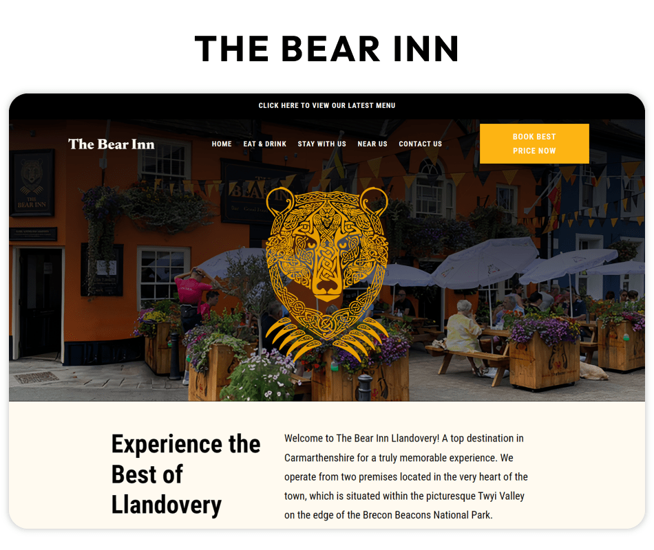
Responsive Web Design Services in the UK

Why Responsive Design is Essential

With over 60% of web traffic coming from mobile devices, responsive design isn't optional—it's essential. Google's mobile-first indexing means your site's mobile version directly impacts your search rankings.

Our responsive designs not only look great but also load faster, provide better user experiences, and convert more visitors into customers across all device types.

Our Design Approach

  • • Mobile-first development methodology
  • • Flexible grid systems and layouts
  • • Optimized images and media queries
  • • Touch-friendly navigation and buttons
  • • Progressive enhancement techniques
  • • Cross-browser testing and validation
  • • Performance optimization for all devices

Why Choose Our Services?

Mobile-first design approach ensuring perfect display on all devices

Improved user experience leading to higher conversion rates

Better SEO rankings with Google's mobile-first indexing

What's Included

Mobile-First Design Strategy
Cross-Browser Compatibility
Touch-Friendly User Interface
Fast Loading Performance
SEO-Optimized Structure
Accessibility Compliance
Progressive Web App Features
Advanced Animation & Interactions
"Our mobile traffic increased by 300% after the responsive redesign. The user experience is incredible!"
Emma Wilson, Retail Business

Get A Free Quote

Book A Free Consultation

Related Services

Explore complementary services that might interest you

Design

Branding & Graphics Design

Create a cohesive brand identity for your new website

Learn more
Marketing

Digital Marketing

Drive traffic to your new responsive website

Learn more
Development

SaaS Development

Add advanced functionality to your web platform

Learn more